
Vodafone UK
Fixing a Pay As You Go journey that lost 70% of visitors
Progressive disclosure, unified pricing and marketing, and refurbished clarity on a buying flow that cut drop-off 14% in A/B testing.
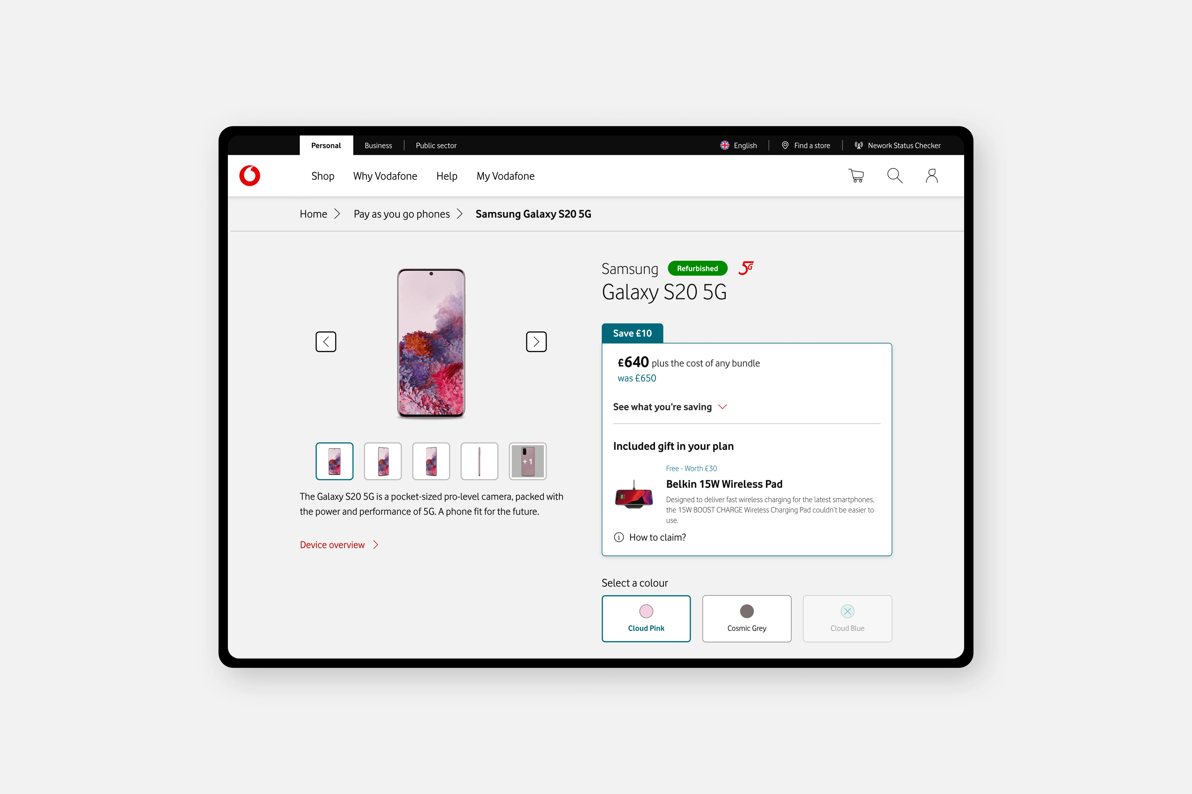
Summary
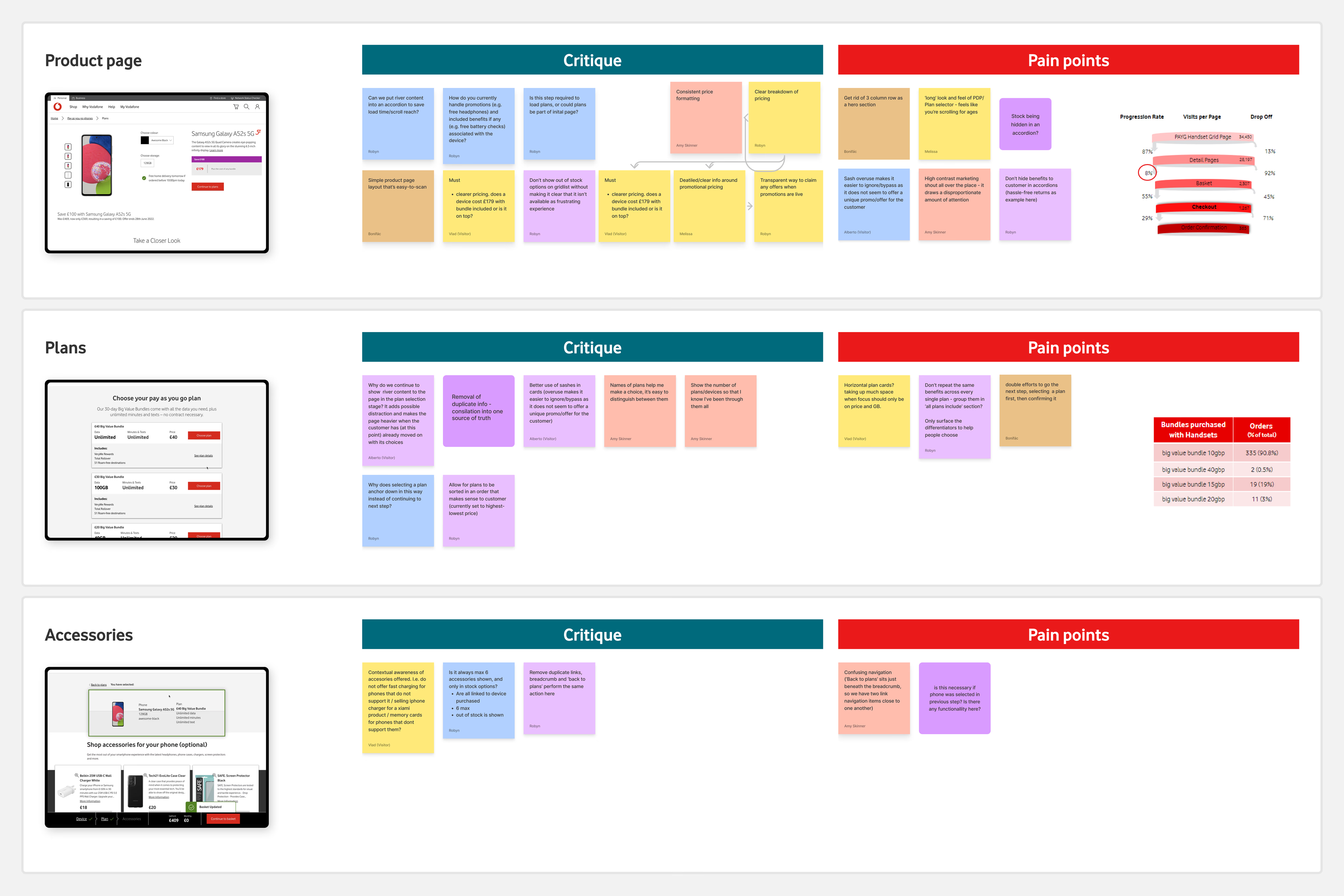
UK Pay As You Go buyers were configuring phones and 30-day data bundles through a journey that spread every decision across overloaded screens. Only 8% of visitors reached checkout. Analytics pointed to a 70% drop-off rate (365 order confirmations from 34,450 page visits). Our job was to stabilize the flow, surface refurbished devices for Vodafone's sustainability goals, and stop losing people to noise.
After multiple rounds of usability testing and one month of A/B testing at 5% sample size, the simplified flow showed a 14% decrease in drop-off. I rolled off before every A/B run finished. Some choices, including bundle sort defaults and refurbished highlights, were changed in production after I left. The numbers below are what we measured while I was still on the project.
The problem
The journey was step-heavy and cognitively loud. Buyers could not see how phone customisation, bundle selection, and accessories connected. Marketing shouts, discounts, and legal copy lived in different places. Discounts often sat far from the pricing box. Terms and conditions sent people elsewhere.
Refurbished devices made the trust problem worse. Sustainability messaging was strong on marketing pages and weak where people actually bought. Usability sessions surfaced uncertainty: condition, what comes in the box, whether a charger or cable is included.
My role
I was a Senior IC Product Designer through Accenture on a three-person team with Robyn (lead) and Levente Pelbát.
Robyn handled stakeholder communication and project supervision. Levente focused on modals, dialogs, and phone listing filtering. I owned product detail pages: micro-interactions, phone customisation, pricing and marketing breakdowns, refurbished and device highlights, and top-up bundle selection. I co-led strategy in parts and led research synthesis and stakeholder comms on my streams.
When Robyn was on holiday, I stepped into temporary lead: reporting to engineers and managers, prepping the next usability round, and working with our dedicated UX researcher. Without that backfill, I think we would have drifted.
What I believed
Uniformity is the foundation of a strong product experience. Bring variants closer together, borrow patterns that already work, and resist inventing a new one for every market.
Clarity first. Put people's choices upfront through inclusive design. Every extra step in a buying flow should earn its place.
Research
An internal benchmarking session brought together roughly 10 stakeholders from design, engineering, and product. We ran multiple rounds of usability testing with 20+ participants, moving from journey concepts to component interactions to final detail passes.
Early testing killed wizard-style steppers that showed upcoming steps. Participants did not need a tour of the future. They needed fewer dead ends today. We borrowed progressive disclosure from an existing Vodafone Spain pattern: after a required action, the flow advances automatically. The device stays on screen so the experience feels like building a package, not hopping between disconnected pages.
We also moved away from double-click confirmation patterns that added friction without adding confidence.
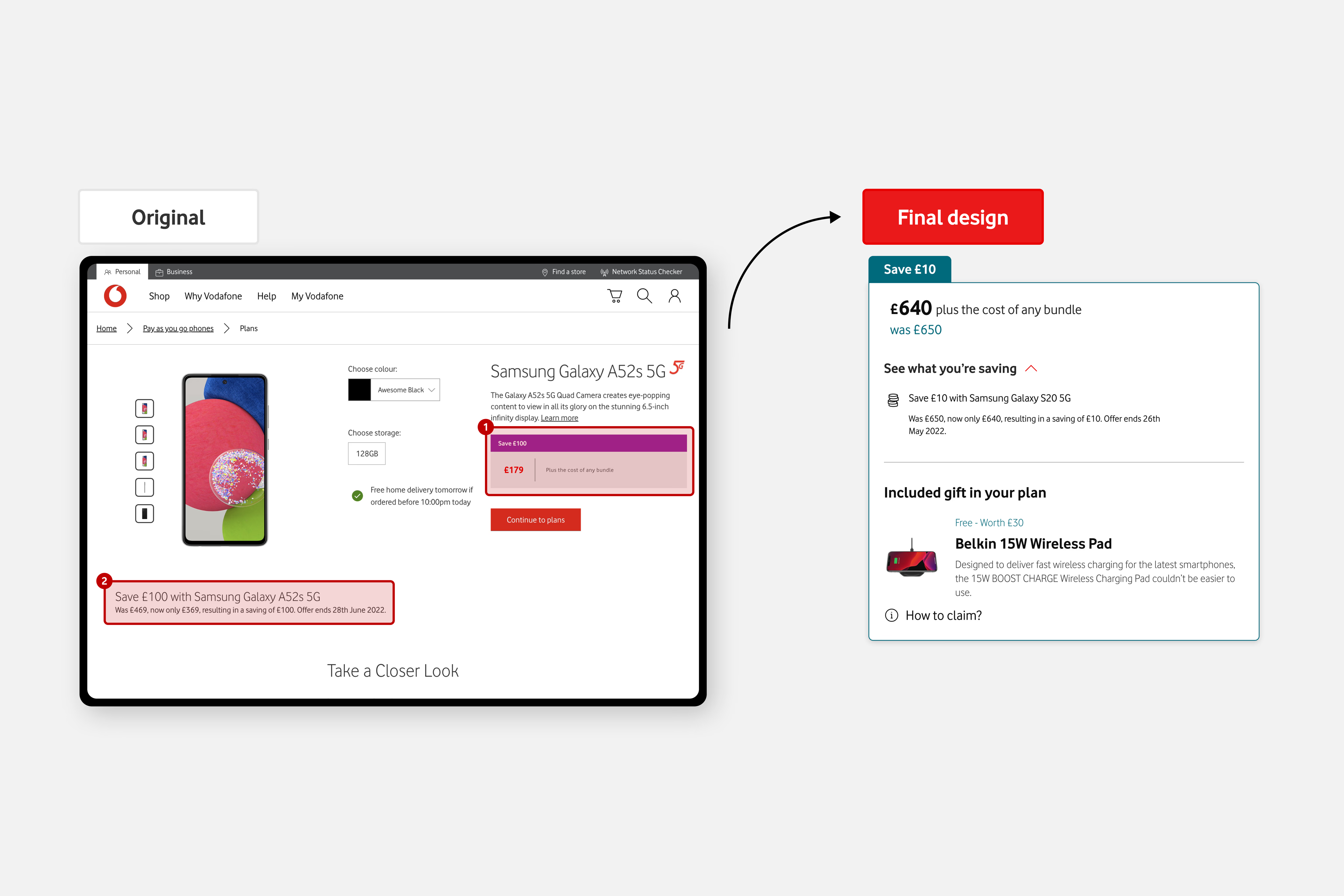
Pricing and marketing in one place
This started as a design proposal: dedicated placement on the product detail page, structured piece by piece for cross-sells and offers. Other buying journey designers noticed, and it became a design-led initiative beyond PAYG alone.
Tabs for vendor and marketing materials were the incumbent pattern across journeys. In testing, tabs ate visual estate before buyers understood the device. Attention went to vendor copy instead of progression. We moved to an accordion so people could collapse legal and marketing content and stay oriented on the purchase.
The bigger fix was unifying pricing drilldowns with applicable marketing, cross-selling, and freebie materials in one module. Discounts no longer floated far from the price. Buyers could read conditions and price impact together. That pattern later spread to other journeys in the program (component detail lives in the design system case study).
Refurbished: what's in the box
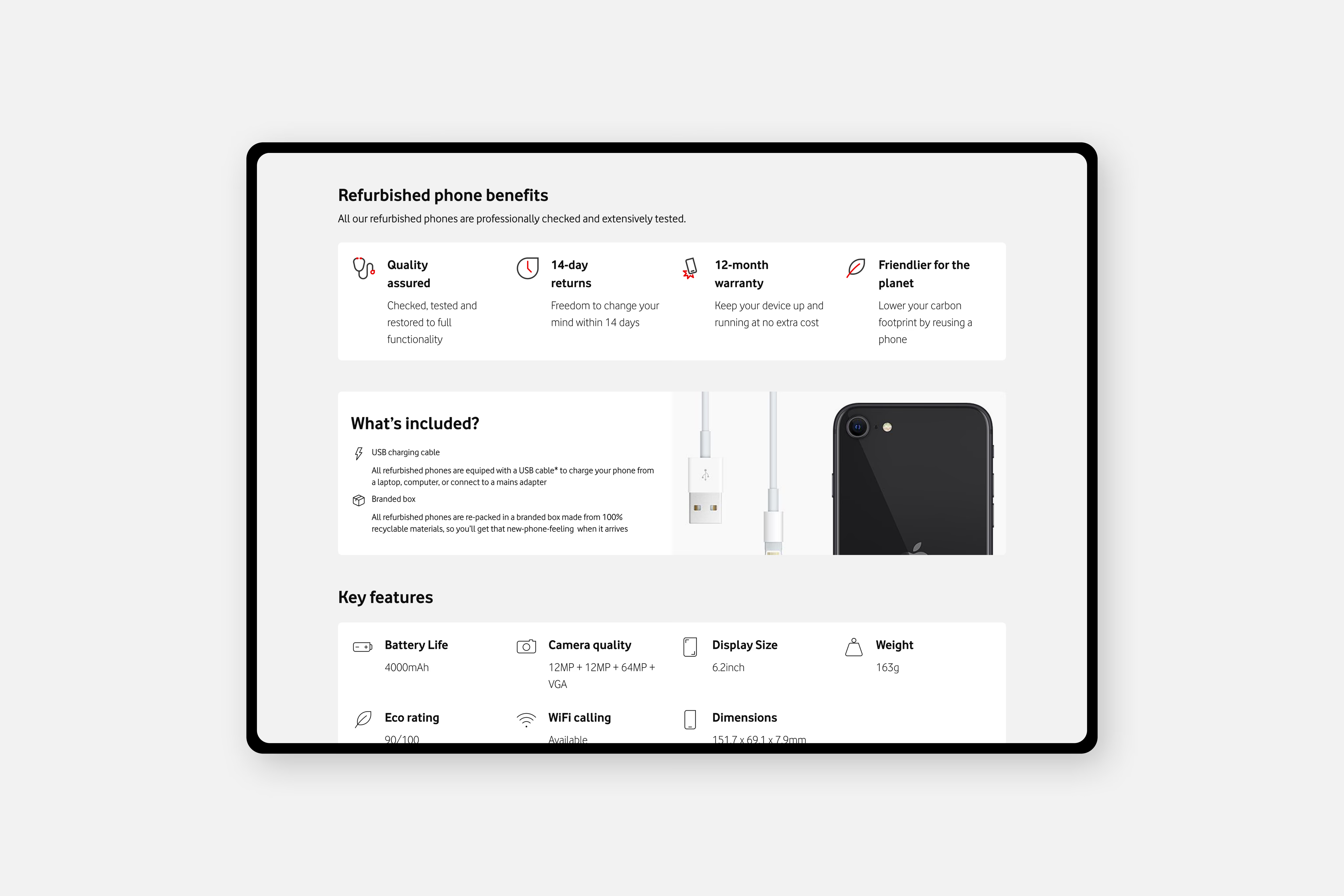
From the first PAYG revamp sprint we highlighted refurbished benefits and key device features on the product page. We iterated structure over time rather than dumping a wall of vendor "river content" on first load.
Usability surfaced the real issue: buyers hesitated on refurbished stock because they could not see condition and inclusions at a glance. That insight fed the "what's in the box" direction and Article Card evolution documented in the design system write-up. On PAYG, the goal was simple: make renew messaging and accessory inclusions visible on the journey, not buried in nested marketing.
One sticky basket bug was less strategic and more embarrassing: monthly cost labels from contract journeys were still in the strip. No PAYG-specific basket existed in Figma yet, and we had forgotten to strip that legacy piece. It mildly confused no-contract buyers until we corrected it.
Messy middle
While Robyn was away, I worried the team would lose thread without leadership cover. I pushed communication with engineering and research harder than I might have otherwise.
Marketing and legal content was the weakest part of the buyer experience until we merged it with pricing. Refurbished uncertainty in sessions changed how we framed device highlights. The pricing initiative grew from a PAYG fix into something other journey teams wanted. Good for impact, harder to scope.
Impact
14% decrease in drop-off
A/B test · 1 month · 5% sample
Baseline
~70%
drop-off
8%
checkout
365 / 34,450
orders / visits
I left before all A/B runs completed
Progressive disclosure removed steps that usability flagged as drop-off drivers (extra summaries, double-click paths). The combined pricing and marketing module received positive feedback and reuse elsewhere.
Honest post-ship notes: Bundle low-to-high sort default was removed in production at some point after I left (it had been retained for a while). Refurbished phone benefits and inclusion details were later relocated into the vendor overview accordion, which softened the at-a-glance clarity we had pushed for. I cannot speak to why; I was no longer on the project.
What I would do differently
Four years on, I would not anchor the whole program on a single buying journey. I would work with the broader design organization on a product-page-to-checkout blueprint shared across journeys, and spend more time in research up front. Today I would also stress-test more use-case variants, including with AI-assisted exploration, which none of us were using in 2022.
What I still carry
I feel nostalgic reading this work. The lesson I keep: consumer buying clarity translates far beyond retail. Even in SaaS and complex data products, the same instincts apply. Put choices first, borrow before you reinvent, and do not hide the information someone needs to say yes.
I still miss not being able to oversee and nurture this journey after handoff. That absence is its own kind of risk.