
Vodafone Global Design System
Validated Through a Buying Journey
Design system compositions tested in a live PAYG journey with real users, then adopted beyond UK Pay As You Go.
Summary
I joined Vodafone's global design system work expecting to refine components in Figma. Within months, a peer and I were assessing and redesigning the UK Pay As You Go buying journey: a flow with a 70% drop-off rate and only 8% of visitors reaching checkout. The components I owned (Gallery, Article Card, Card Promo Slot, Basket Flyout, Functional Carousel, Extras Card) were not side projects. They were how we proved the system against a real journey, with usability sessions and A/B testing, before other teams picked them up.
The problem
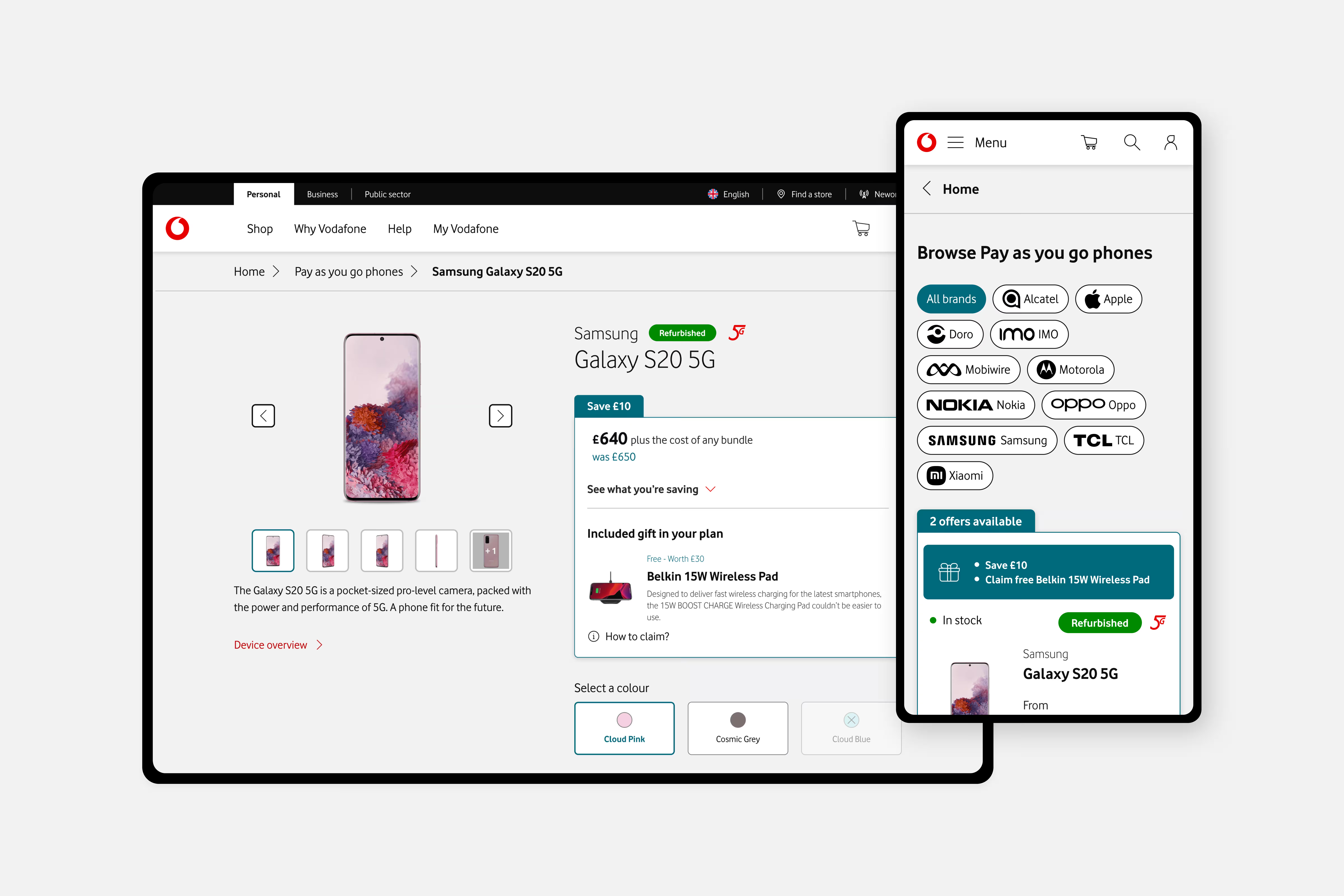
Vodafone's local chapters each had their own design toolkit, patterns, and even software (Figma and Sketch). Contributors lacked a shared DesignOps flow. On production sites, the same "component" often meant something different in consumer, business, and public sector journeys.
That fragmentation showed up everywhere. Before I unified the Gallery, subsidiaries ran different image controls: dots, icon buttons, vertical or horizontal thumbnails, each treated as the local standard. Article Card-like layouts on live sites were hard-coded one-offs. Over time, standards drifted until pages looked like a rainbow of directions.
We were building a global library, but libraries do not adopt themselves. We needed a journey painful enough to force honest validation.
My role
I was a Design System Designer on contract through Accenture, not a Vodafone UK employee. I owned Gallery, Article Card, Card Promo Slot, Basket Flyout, Functional Carousel, and Extras Card end to end: research, variants, workshops, documentation, and handoff.
Levente Pelbát, a fellow Hungarian designer, and I were originally scoped as design system contributors. We were then asked to lead assessment and innovation on the PAYG buying journey itself. I drove workshops, shared Figma practices, and mentored junior designers. Governance approvals sat with Source and Design System Governance; that was not my lane.
What I believed going in
A component is not ready when it passes a design critique. It is ready when it survives a real user journey: the full problem space, not an isolated frame in a review file.
Testing a card in a vacuum stacks up internal opinions. Testing it inside a journey with a measurable drop-off problem forces a different conversation. That belief shaped every composition I shipped from this period.
The pivot
The messy part was not choosing between three polished concepts. It was the scope shift.
Levente and I were meant to iterate on the global system. Then PAYG landed on us: stabilize a journey bleeding users, promote refurbished devices, and unify marketing noise on product pages. We were suddenly full-stack on a consumer buying flow while still accountable for DS deliverables.
During PAYG assessment on refurbished devices, I found something that stuck with me. Information about what comes with a "like new" device (charger, cable, Vodafone's renew messaging) lived deep in nested marketing content, not on the buying journey where people decide. Shocking is the right word. Sustainability was loud on marketing pages and quiet where the purchase happens.
Governance added friction. Workshops were supposed to surface critique on components under revision. Sometimes the relevant parties were hard to pull together. Sometimes feedback felt cautious, as if people held back honest assessment in the room. I learned to treat workshop design as part of the craft, not an afterthought.
Gallery: when serving everyone served no one
Each subsidiary wanted their gallery "standard." I tried to honor that in one unified component.
We experimented with an infinity-style gallery without image previews or a clear count. We turned dots into thumbnail indicators, added an icon button for pagination over the next set of thumbnails, and kept the main image on a separate click path. The icon button did not control the image in view. Users had to click a thumbnail anyway.
We spent serious time usability-testing that version. It failed. Users expected the controls to work the way galleries work elsewhere. We had optimized for internal politics, not behavior.
What I would do differently: bring more external evidence earlier. Not only competitor audits, but strong gallery patterns from companies outside telecom. I was seeing great examples even then. A thicker benchmark deck might have shortened the fight over local defaults.
Article Card: the crusade that never shipped globally
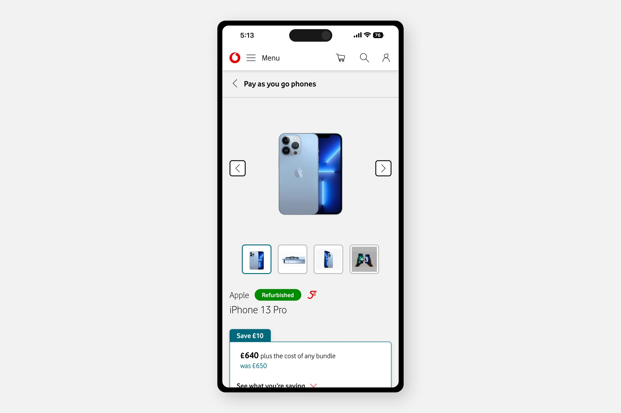
Article Card partially existed in Figma, but production had diverged. Consumer, public sector, and governance pages each hard-coded their own card-like layouts. Standards had eroded.
I treated the rebuild as personal mission work for two reasons. First, refurbished PAYG buyers needed to see what comes with a device at first glance, not by expanding vendor materials and reading between the lines. Second, one visual language for cards (marketing, value props, offers, blog tiles, video thumbnails, complex grids) would have strengthened brand perception across journeys, including business and public sector, even though the original composition was not built for consumer flows.
I researched variants, ran workshops with designers to gather requirements, and specced documentation and builds. The unified Article Card never made it to global production. That is part of the story, not a footnote. Adoption through governance and eng backlog was the harder problem than the Figma file.
What I would do differently: engage stakeholders outside the design org earlier, especially teams working on public sector and governmental experiences. Their requirements would have strengthened the pitch and the variant set.
Components that held up in PAYG
While Gallery and Article Card carry the cautionary lessons, other compositions were built and pressure-tested in the same PAYG program (documented separately in the PAYG buying journey case study).
Card promo slot on the product detail page
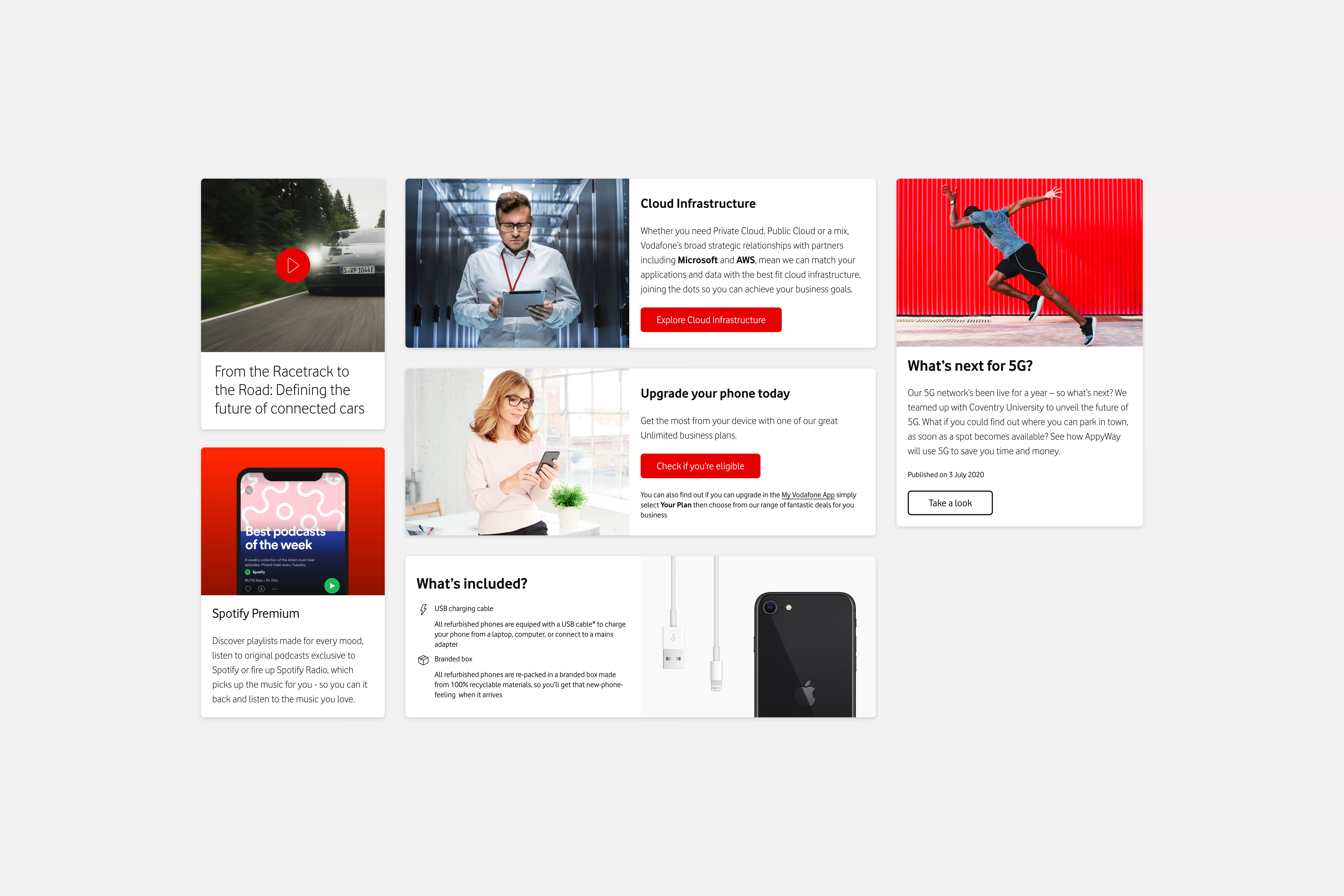
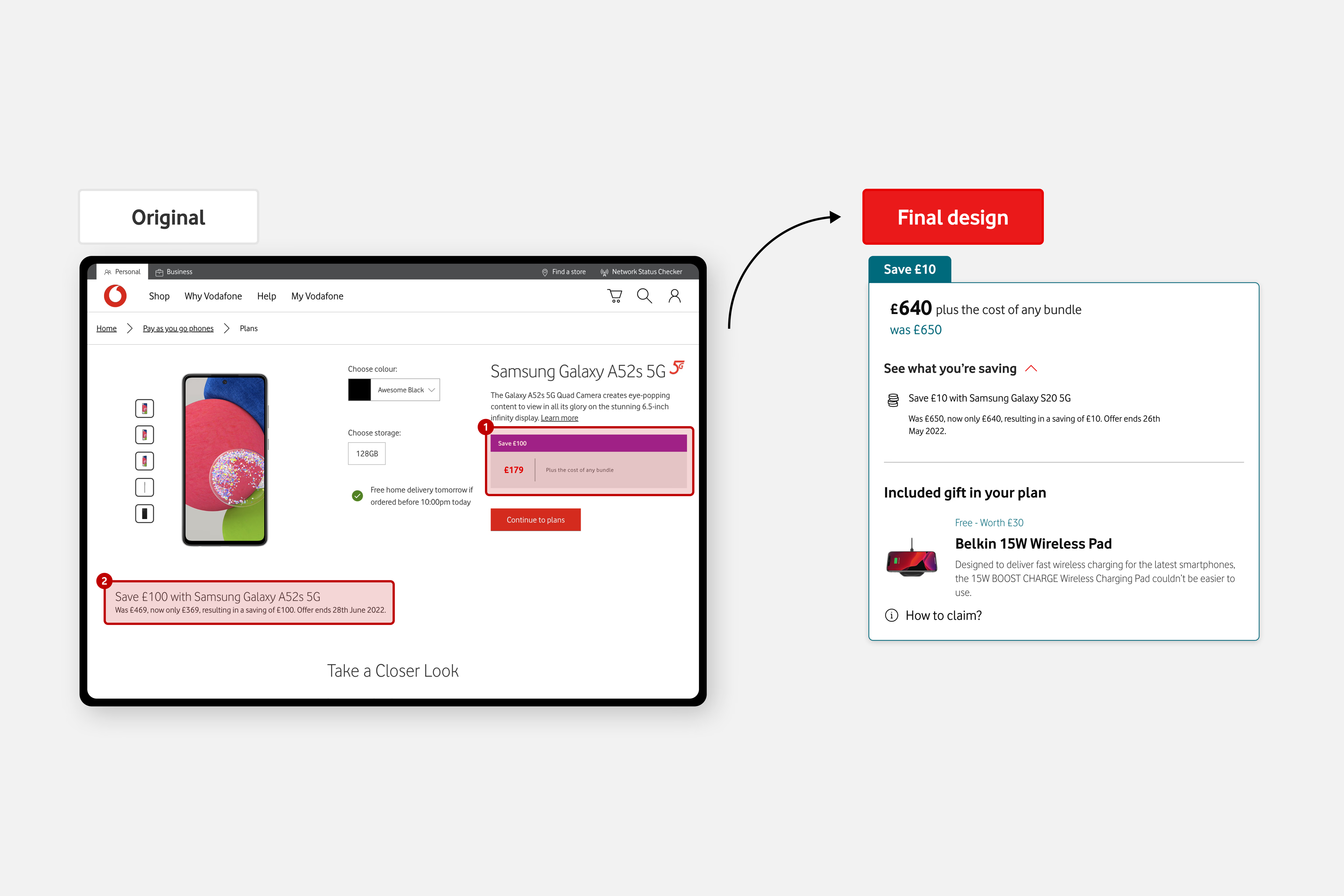
Card Promo Slot targeted the product detail page, where marketing had grown messy. Promos and shouts showed up in different formats with no shared pattern: under the Gallery, under the pricing box, and in the middle of vendor river content. Card Promo Slot gave that material a consistent slot so offers, cross-sells, and seasonal copy did not compete for attention across the page.
Basket flyout, carousel, and extras card
Basket Flyout replaced a template with non-universal spacing, weak responsive spacers, no path to remove add-ons, and WCAG gaps. The rebuilt flyout could adapt consumer vs business journeys (VAT suffix, optional third column for installments vs PAYG).
Functional Carousel addressed a legacy pattern that failed WCAG (dots and loaders as graphical objects), mixed arrow usage across subsidiaries, and a five-item cap in production. The new approach scaled with responsive spacers and clearer arrow behavior tied to Gallery and Article Card work.
Extras Card was my first design system task on the project and the most politically loaded: global stakeholders, consumer vs business extras, and a unit selector slot with heavy state complexity. I got it to a spec that let users compare packages and benefits without drowning in add-on detail.
Impact
14% decrease in drop-off
A/B test · 1 month · 5% sample
Baseline
~70%
drop-off
8%
checkout
365 / 34,450
orders / visits
I left before all A/B runs completed
We validated compositions in usability testing and A/B testing on the PAYG journey. The PAYG program reported a 14% decrease in drop-off after one month of A/B testing at 5% sample size on the simplified flow. I rolled off before all A/B runs finished, so I do not have later numbers.
After PAYG validation, the Pay Monthly product team adopted Card Promo Slot, Gallery, and Article Card work quickly. I believe Hungarian and German market units picked up some of this as well, though I cannot verify adoption depth from here.
The unified Article Card spec did not land as a global production component. Gallery, Card Promo Slot, and Basket Flyout patterns traveled further. Honest split beats a single "everything shipped" headline.
What I carry forward
My biggest takeaway is still going beyond the minimum brief: using a journey crisis to prove the system, not just fill a component backlog.
Governance was imperfect, but the people around the work mattered. Levente, other design system designers, and even indirect peers pushed each other's crafts daily. It was never a one-person show. More voices made the work better, even when opinions clashed.
If I ran a similar program again, I would widen the table earlier: product managers and SMEs, not only the designers who happen to use a component slated for revamp. Design systems fail quietly when adoption is treated as a design-org problem alone.