
Raiffeisen International
B2B user management for relationship managers
Redesigned myRaiffeisen profile creation and assignment for bank admins: fewer touchpoints, clear status, and scan-first layouts validated in 40+ usability sessions.
Summary
Relationship managers and backoffice colleagues at Raiffeisen used myRaiffeisen to create customer profiles and assign B2B financial services. The tool had never been through a design pass. Business analysts and engineers built version one, and daily work meant repetitive touchpoints, opaque activation status, and no quick way to see what was already assigned.
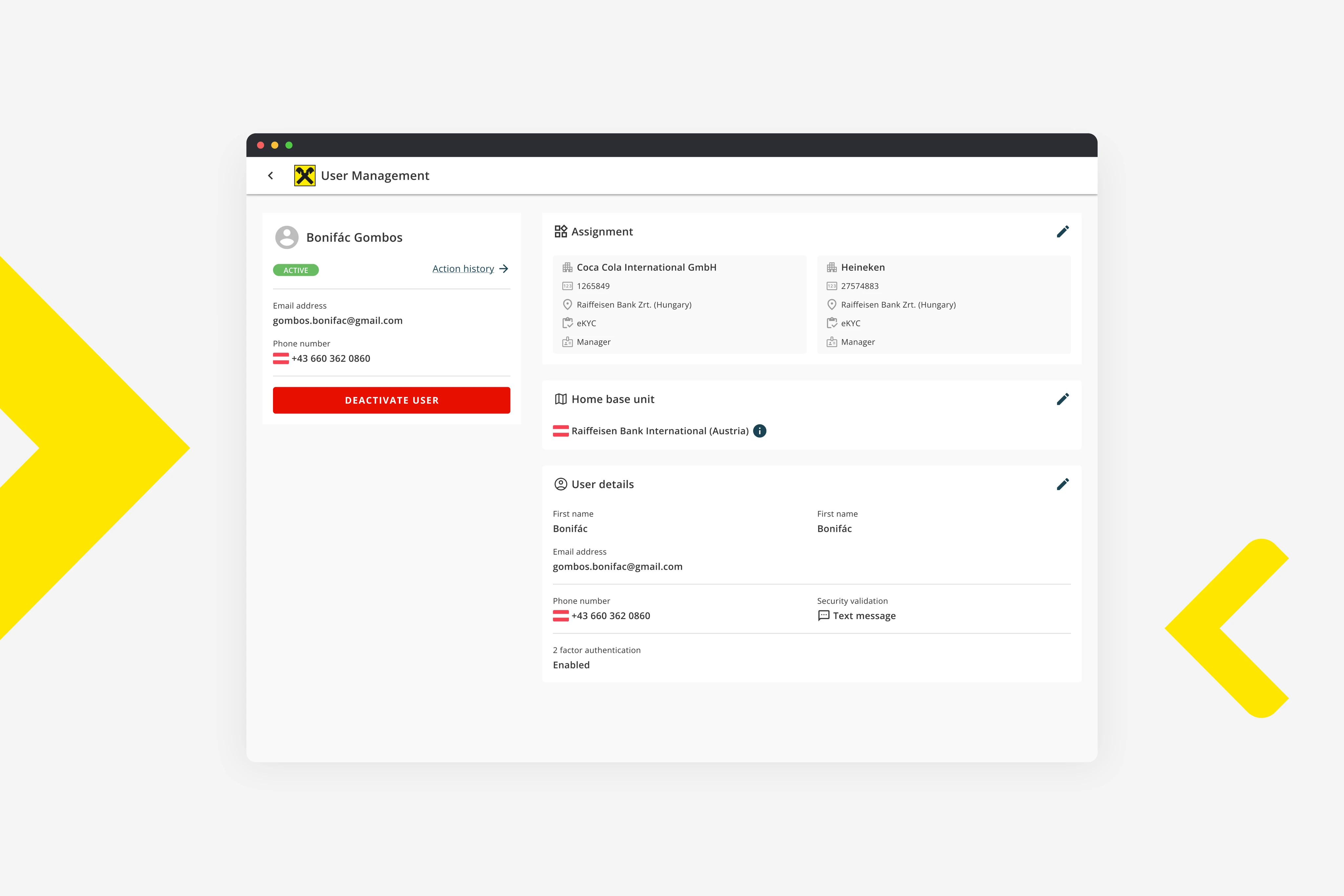
I led the user management redesign from research through handoff. The shipped solution split dense creation into steps, put assignment on screen instead of dialogs, made status readable when onboarding could take days, and let admins edit one section at a time. We ran more than 40 usability sessions with relationship managers and support colleagues. Validation participants often said the new flows felt faster; I can't disclose internal before/after scores or time-to-completion figures here.
The problem
Profile creation stacked auth conditionals, phone validation choices, and service assignment into flows that felt unpredictable. Assignment lived in stepper dialogs that peers called the most annoying part of their day. Activation could take several days, yet admins had little feedback on whether a reactivation link was sent, an email expired, or an account was locked.
The layout was not built for people who scan all day on smaller screens. Experiments with vertical, table-like clusters still felt like legacy patterns pasted into a new shell.
My role
I was Lead Designer through Accenture, embedded with Raiffeisen. I owned research (cognitive walkthroughs, UX audits with platform design), flows, visual design, and engineering handoff.
Mihaela Alexe joined later as an FTE designer. She shadowed, then contributed; toward the end I shifted into supervision while she supported delivery. Stakeholders included a long-tenure platform design peer, our BA, an engineering manager, front-end and back-end engineers, and product managers.
The team was welcoming. Engineering, BAs, and platform design were trustworthy partners from the start. Early collaboration still felt uneven on my side: before Raiffeisen I had mostly designed consumer experiences, not internal tooling. I had to learn how backoffice work actually runs before my proposals matched what the room needed.
What I believed
Productivity is the goal for internal tools. B2B2C platforms like this deserve the same design care as customer-facing products. I have seen too many backoffice products treated as afterthoughts.
This was early service design for me: shape the GUI and the process. Flows had to stay flexible and forgivable when account representatives need exceptions to speed a customer onboarding.
Research
We ran cognitive walkthroughs and UX audits with the platform design team, then more than 40 usability tests with relationship managers and administrative colleagues.
Research showed onboarding is not always linear. Sometimes reps run eKYC while customers already explore other assigned services. Analytics suggested one-service-at-a-time assignment; observation showed real work was messier. We stopped designing for the tidy case only.
Mid-project, the Hungarian and Austrian branches started collaborating on a shared user-management flow. Hungary had been on a different customer-management tool, which meant we had to introduce a new authentication method for the aligned experience. Local rules and legacy workflows kept adding conditionals. A single-page create flow failed in usability testing, which pushed us toward a stepper.
Creation: from one-pager to stepper
I tried an updated one-pager that had to absorb the HU/AT alignment and the new auth method Hungary required. Usability said it was too dense. Conditionals read like acceptance criteria stacked on one screen. I split creation into a stepper: one context per step.
Conditional auth: network units differed across the merged flow. If a unit only supports one authentication method, we hide the picker instead of showing a fake choice.
Phone numbers: colleagues struggled to pick the right security validation. I paired inputs with API feedback that distinguishes landline from mobile.
Review before create: a summary step with a compact top-down assignment layout so reps see customer IDs, services, and roles before submit. Engineering sometimes pushes read-only form fields instead of a designed review screen. I kept fighting for a readable review state. It is not decoration; it is where mistakes get caught before they hit a customer relationship.
Assignment: on-screen building
The old stepper dialog for assigning services felt unpredictable. Reps needed wayfinding inside profile building, not another modal maze.
I moved assignment to an on-screen building experience: fewer touchpoints, clearer progression, same pattern in create and edit. Backoffice feedback called this the biggest relief in the redesign.
Profile management: scan, then edit one slice
Vertical table layouts failed in walkthroughs. Admins needed a compact non-edit mode that surfaces status, actions, and essentials immediately. When the right column exceeds the viewport, tab anchoring jumps to the section without long scroll hunts.
For edits, wizard mode was wrong. Users change one field, not the whole profile. Section-based editing lets them open only the topic they came for. Engineers often descope inline edit; daily users pay the tax every time.
Status when onboarding takes days
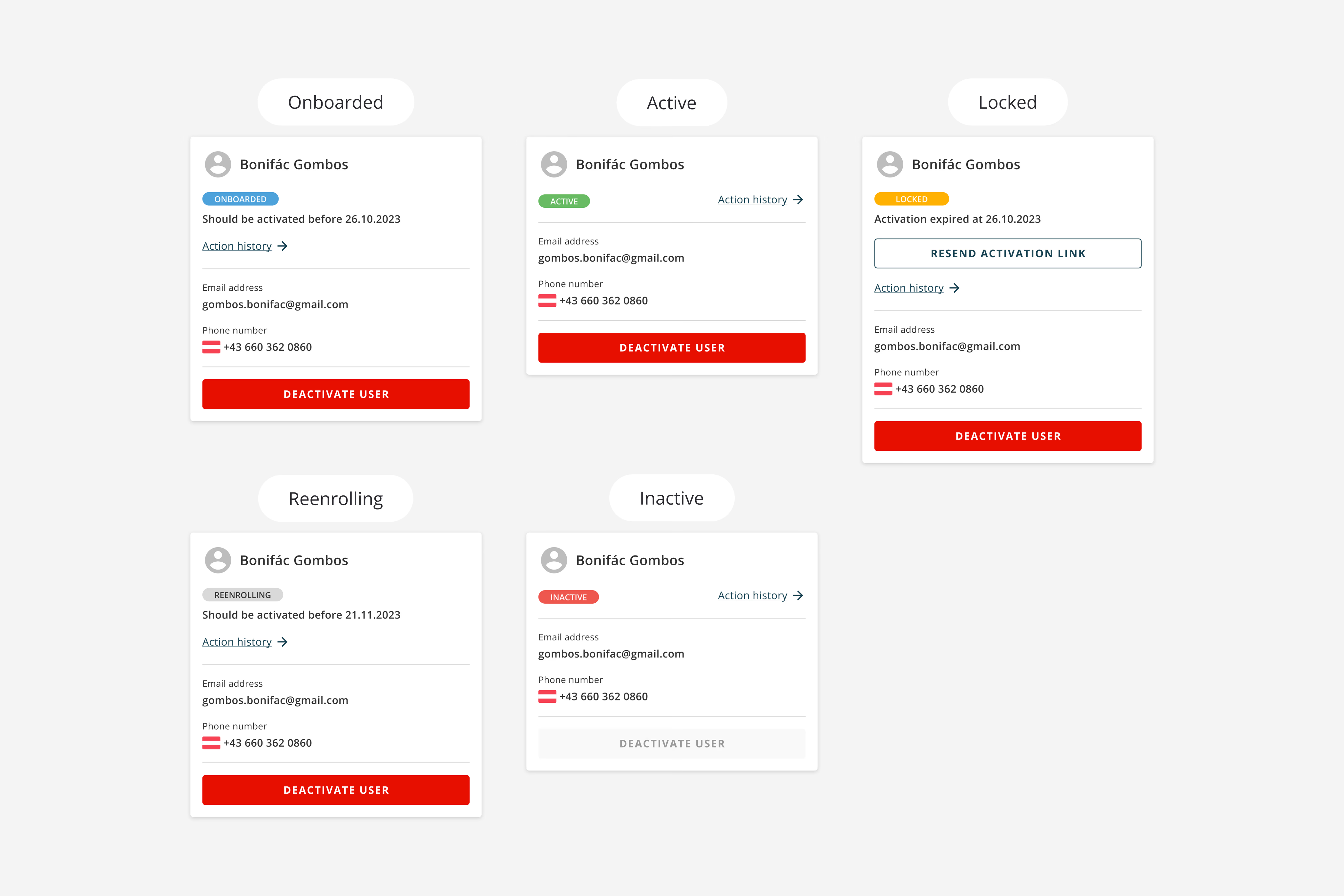
I restructured status messaging: onboarded, reenrolling, expired activation links, locked accounts after failed passwords. Admins get due dates and next actions instead of guessing where a customer sits in a multi-day pipeline.
When onboarding is async, status is the product for the internal user.
Messy middle
The Hungarian and Austrian alignment stirred the water: Hungary's legacy customer-management tool forced a new auth method into the flow, and conditionals piled up from there. I was still finding my footing in admin tooling while the team kept the door open. That mismatch, not hostility, made the first stretch of the project feel less straightforward than the working relationship deserved.
Handing off to Mihaela near my roll-off was bittersweet. Overlap in responsibilities, but we treated each other as equals. Nothing on the roadmap felt like it almost died in governance.
The work felt like diplomacy. Onboarding puts the bank–customer relationship on the line. I studied international relations; an ambassador once said you never get a second chance at a first impression. A bank with Raiffeisen's history carries ceremony in real life. The UI should respect that weight, not feel like a generic admin template.
Impact
40+ usability sessions
Relationship managers & admin colleagues
Outcome
Shipped
redesign to production
Fewer
touchpoints
On-screen
building vs dialogs
Validation participants often said the new flows felt faster; assignment drew the strongest feedback. I can't disclose before/after usability scores or other internal efficiency metrics.
What I would do differently
Today I would spend more time mapping relationship manager processes end to end. I would add qualitative interviews with corporate customers and their employees, not only banking reps, to understand the back-and-forth in onboarding and where the handoffs break.
What I carry forward
Backoffice tools are pillars of a well-oiled operation. They still need design attention. Consumer-grade clarity belongs in SaaS and in complex data products too. This project is where I started treating internal flows as service design, not skin on legacy logic.